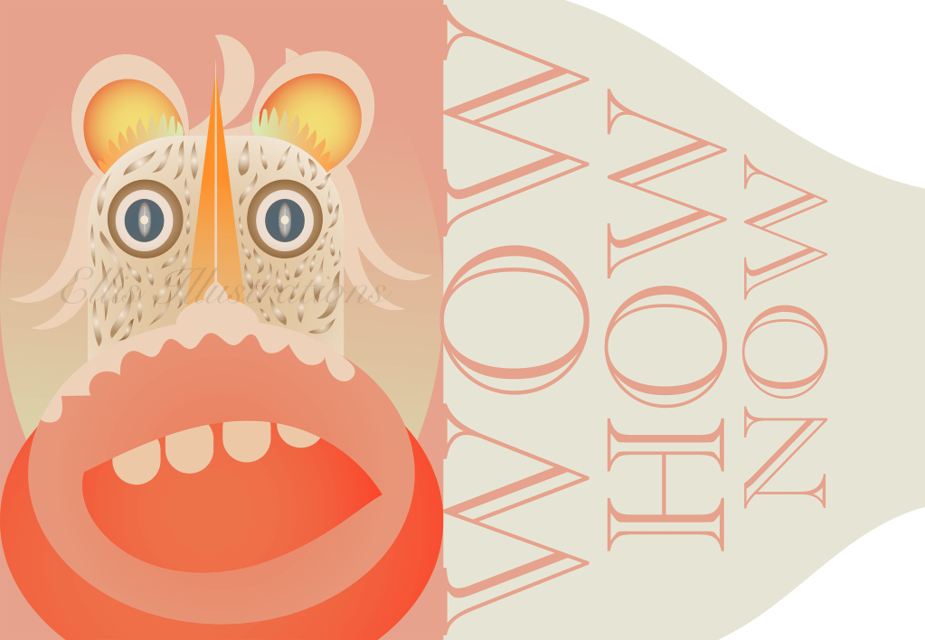
This is another illustration for publishing projects. This is just an illustration for publishing media. This is for fiction and the characters are not a resemblance just imaginative. I see a lot of illustrative publications which is great. It seems that illustrations are in fashion for this type of content.
This is a publishing style illustration. This has been made in a certain decorative style using bright colours and some texture to add some depth. It was great to try this style too while adding some more detail.
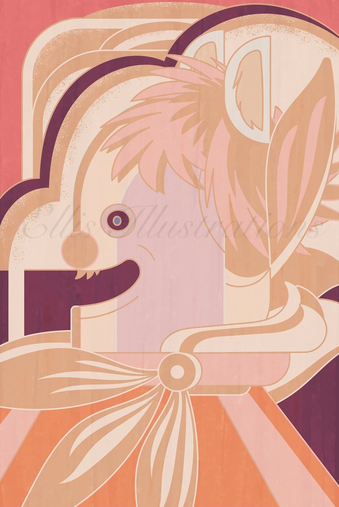
What is this character trying to say? It seems to be in a great mood smiling which can never be a bad thing at least for me. I am happy to see people smiling and especially the characters I create. This is not dependent to any “obscure and scary weathermen”.
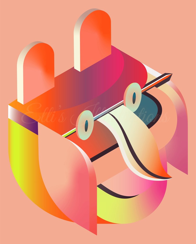
Going beyond any of this, this is just a simple picture book style publishing character. The design is flat with some thicker strokes and sprinkles of colours that are pleasant. This could be a fashion illustration as well, despite the fact that this is not really a human character.
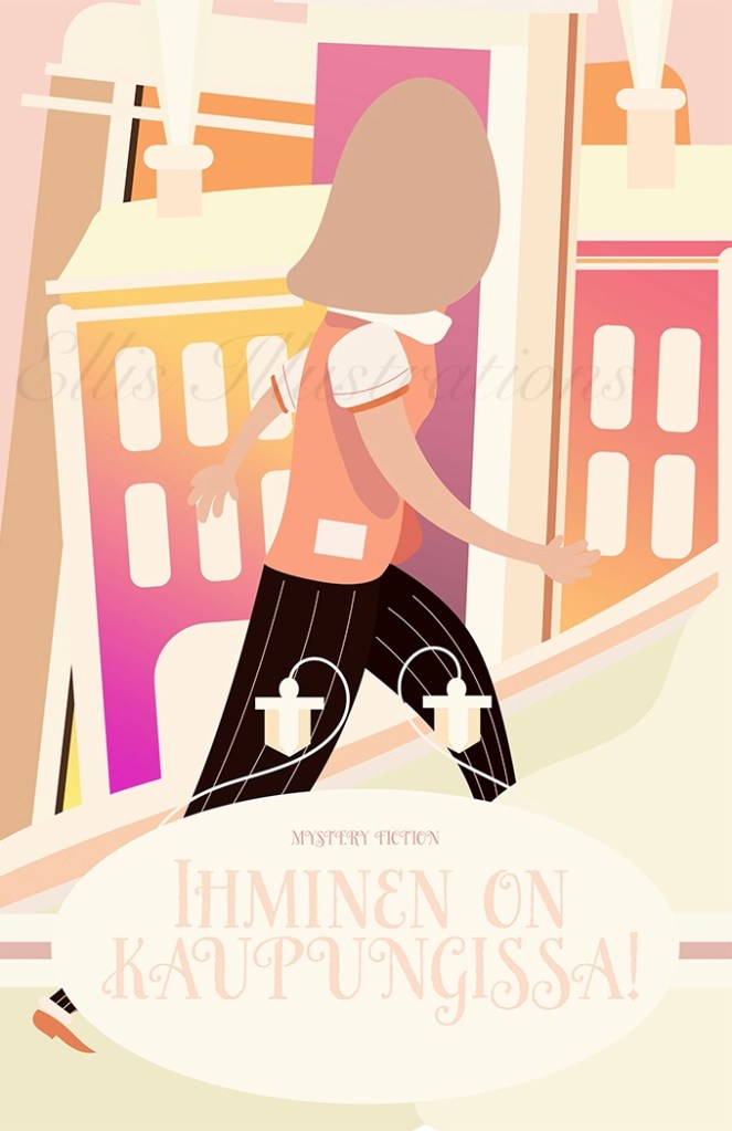
This is another illustration for publishing and media content. I have created the illustration of this mysterious character first and then I have incorporated it into a playful fashion design publishing style. It was great to try this style and to create this kind of content design.
This is an isometric style media style icon illustration mostly with beauty and style oriented colour selection. I have obtained the isometric balance on it, while being a little more freed up in terms of shapes and shades in the making of this imaginative character.
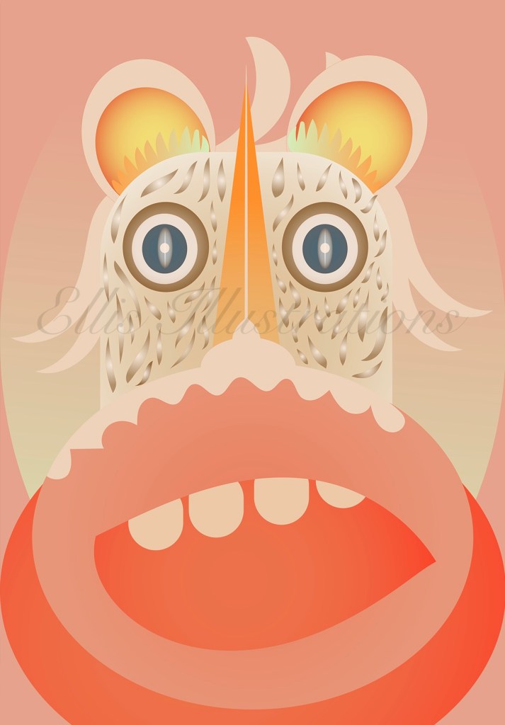
What could it be while it’s a cat, it’s not an owl, it’s not a bunny but is still has some features from all of that!
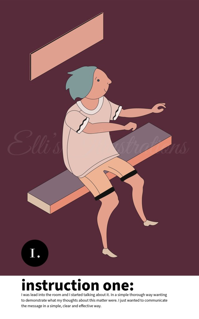
This is an instructional style illustration featuring a fictional person and a short description that combines with this illustration. I have again tried to create a character in isometric style, as I find that this style matches greatly with illustrations that belong into the more informative genre.
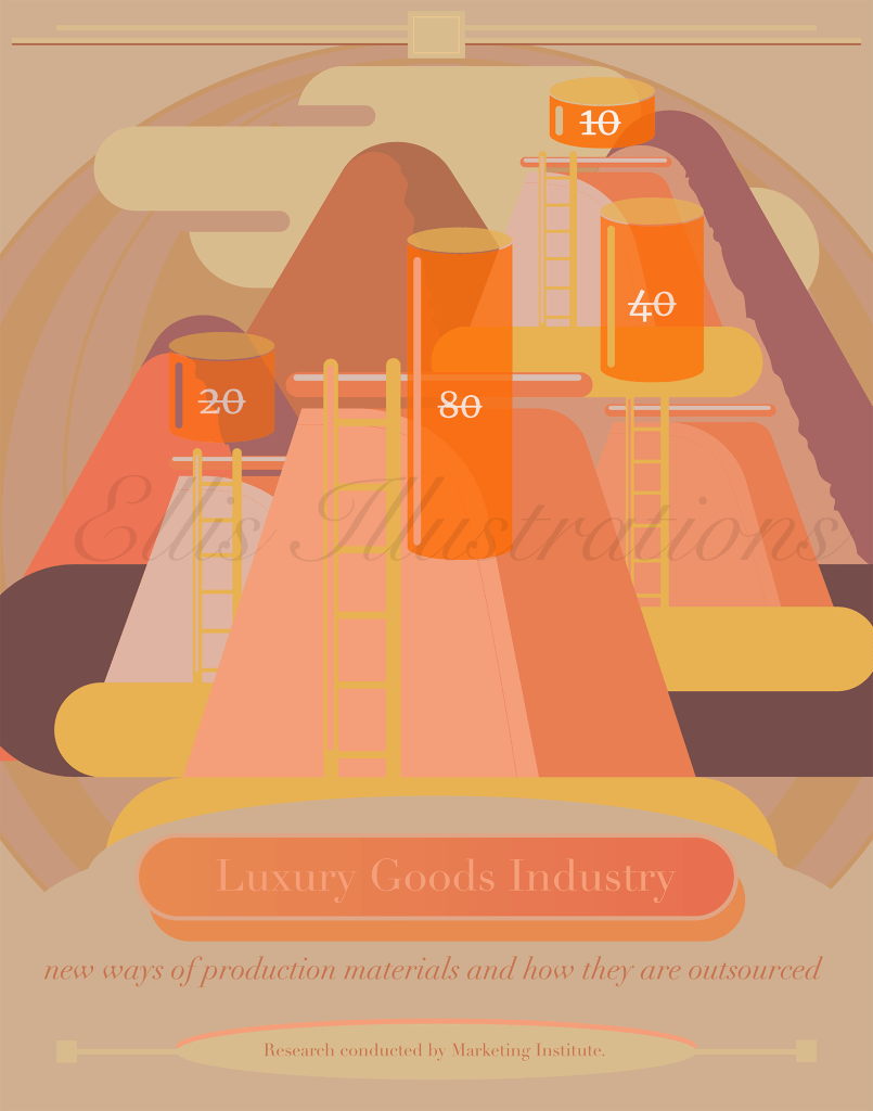
This is a lifestyle illustration cover for a luxury themed publication about how luxury products are produced. Despite its industrial kind of feel it keeps pleasant colour pallets, with subtle colours and gentle fonts. This was great to do and to also keep it without any special textures just focusing on the main points of what might be interesting due this data specific publication about luxury products. It is also playing about with the industrial element without really being industrial at all as this is about luxury stylish brands but looking from outside into how these are produced. I would say this is more keeping it functional in terms of illustrating something bridging the industrial with a more stylish design. Just my take on it!
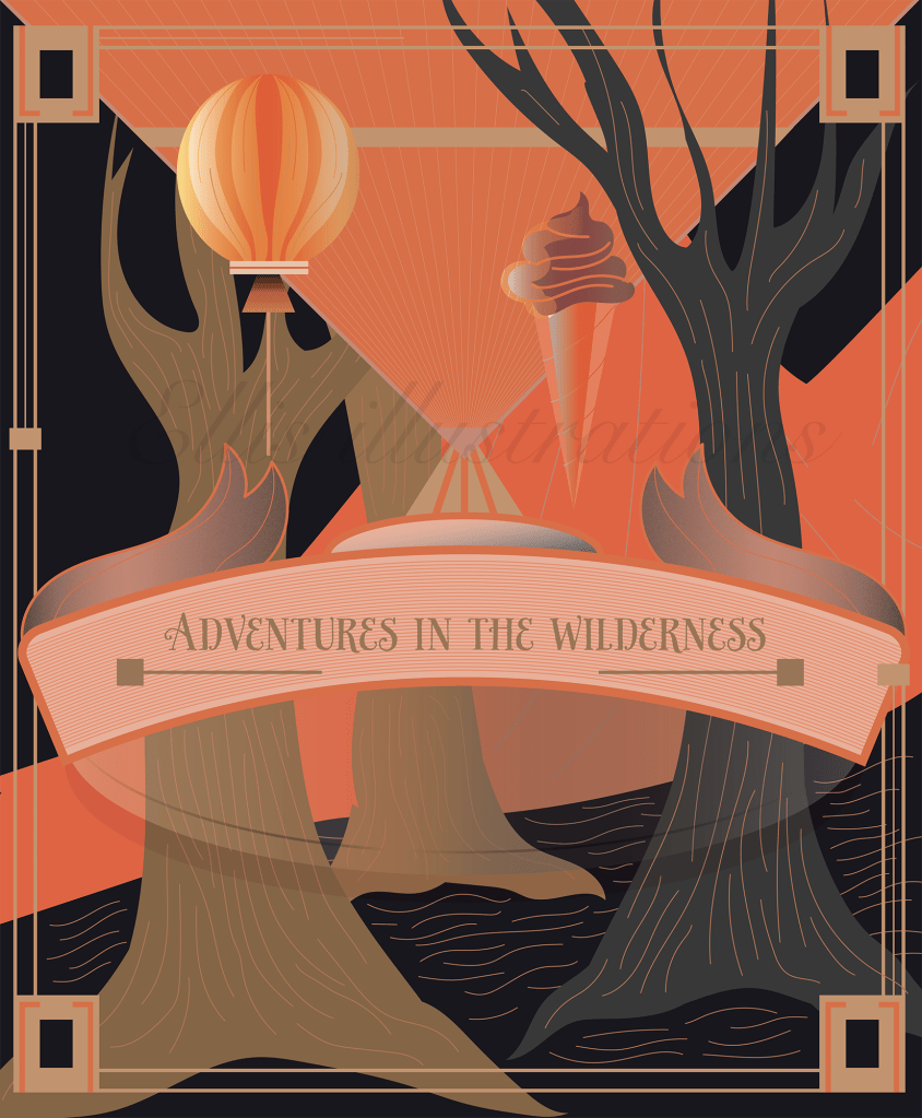
This is another illustration about a cover of what the title describes. I wanted to create an illustration that combines small things that make a great day while keeping the essence of the wilderness element and adding a decorative style to this in order to make it more detailed.